Establishing your Instagram aesthetic is no doubt a challenge, but very important if you are trying to grow your account and create a business out of your Instagram. When one first clicks on a new profile, what they immediately see is an overall feed – so if this is visually appealing and interesting, people are more likely to follow. As a brand, it is crucial to show who you are and what your brand’s “vibe” is.
The Background Feature
We used our own designs as the background the give the page a cohesive look and to also showcase our prints without being too “salesy.” Subtle branding sometimes works best.
But P.S. you can shop our silk scarves here;)


Flare Feature

Clone Stamp
For an artsy, kaleidoscope feel – you can use the clone stamp which allows you to select the part of the image you want to clone and then you can do this as many times as you’d like.
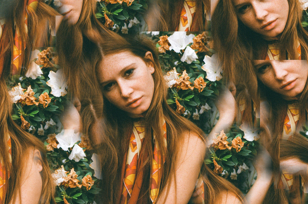
Photo by @grantspanier
Mirror Feature
Double trouble. We love the mirror feature to spice things up, because sometimes two is better than one;)

Layer Photos
Layering photos is great for double exposure posts which are a cool, artsy aesthetic.
Stickers + Text


MORE USEFUL TIPS:
PLAN YOUR FEED AHEAD OF TIME
We use Planoly to plan our feed. I import the photos I want to post and I play around with the order of them and plan at least a few posts ahead so that I know how pictures will look next to each other. This also helps to make sure that when two photos are next two each other, the colors match. So that if a cool tone photos is next to a warmer photo, you can edit one of them to look cohesive next to each other.
THEME IN BLOCKS
It isn’t always easy to keep your feed looking the same, especially with travel, influencer or celebrity posts or specific campaigns.When you plan on mixing it up whether it’s travel or a specific event – change it up to that style for 3-12 photos so the feed still looks cohesive.
LOOK AT THE STATS
According to a study by Curalate (links to a really cool infographic) of over 8 million Instagram photos, here is what works on Instagram:
- High lightness generates 24% more likes than dark images.
- A high amount of background space generates 29% more likes than those with minimal space.
- Images featuring blue as the dominant color generate 24% more likes than images that are predominantly red.
- A single dominant color generates 17% more likes than images with multiple dominant colors.
- Images with low saturation generate 18% more likes than those with more vibrant colors.
- Images with high level of texture generate 79% more likes than those without.
If you don’t love the aesthetic you choose, it will be hard for you to keep it up. So if you’re attracted to bright photos, then stick with that, regardless of what the statistics say.
Hope this was helpful and don’t be afraid to share:)